Hey Tea Sippers!
For over a decade, Tea Haus has been a cherished family-owned tea shop, situated in the scenic town of Saugerties, NY, on the edge of the cultural hub of Woodstock. Known for its health-focused, artisanal offerings and its founder's personal, artistic touch, Tea Haus decided to embark on a new journey: transitioning into the digital world.
Overview
The goal was to create a strong, cohesive brand identity for Tea Haus while preserving its charm, casual vibe, and health-conscious ethos.
The goal? To build an online store exclusively for their hand-selected loose teas, while maintaining the charm, personality, and warmth of the physical Tea Haus experience.
The experience had to be seamless, with an engaging user interface designed to appeal to both local customers and global tea enthusiasts.
A strong online presence was essential, requiring a simple yet elegant WordPress/WooCommerce website to showcase a carefully curated selection of premium teas.
Accessibility was a priority, ensuring full compliance with ADA guidelines to create an inclusive experience for all users.
As we explored the competitive landscape, it became clear that common pitfalls for many tea websites were poor user experience and outdated design.
With Tea Haus, our mission was to raise the bar—creating a standout online experience that was not only visually stunning but also functionally seamless.

Branding
Designing a Brand with Character
Defining the Brand Essence
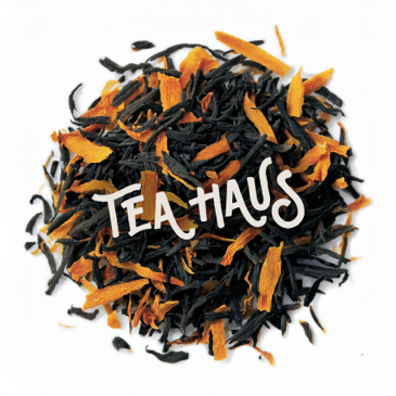
One of the biggest challenges in branding was finding the right balance between personality and simplicity. The logo needed to be memorable without feeling overcomplicated, something that could capture the playful and inviting nature of Tea Haus while remaining timeless.

Colors That Speak Tea
Choosing the right color palette was a pivotal step in shaping Tea Haus's visual identity. The goal was to narrow down a direction and colors that serve as visual markers, embodying the brand's narrative.
The final palette was inspired by the natural shades of tea.

Indigo Tea Leaf
Inspired by the deep, rich hues of fermented Pu-erh or oxidized tea leaves that sometimes develop a dark, indigo-like tint.
Lavender Silver Needle
Resembling the soft, muted lavender-gray tone of fine white tea buds like Silver Needle, covered in a delicate downy fuzz.
Wild Rooibos
Evoking the reddish-orange of the Rooibos plant leaves before they are brewed, capturing their natural, vibrant color.
White Peony Vein
Mirroring the creamy, off-white tones of fresh White Peony (Bai Mudan) tea leaves, and their lighter veins.
Typography
Form and Function
Form and Function.
Typography plays a central role in shaping the Tea Haus identity. We focused on balancing the decorative vintage-inspired logo with clean, modern sans-serif fonts to achieve both visual charm and digital functionality and accessibility.

User Experience
Shaping the experience
Key UX Features
Filters and Categories: Simplified navigation for tea types and flavors.
Storytelling: Each tea’s page includes its origin, health benefits, and brewing instructions.
Streamlined Checkout: Minimal steps, multiple payment options, and mobile-friendly design.
Personal Touch: Thoughtful messaging throughout the site creates a welcoming and friendly experience.
Accessibility Compliance: The site meets ADA standards, ensuring inclusivity and ease of use for all users through thoughtful accessibility design.
User Personas
Through careful analysis and consideration of Tea Haus's unique audience, we defined five key personas that represent the diverse customers who engage with the brand, both in person and online.


User Scenario
Persona
Robert, 46, a tea enthusiast from San Francisco who values high-quality, premium teas.
Context
Robert is searching online for unique, premium teas when he comes across an intriguing blog post from Tea Haus.


Outcome
Robert discovers Tea Haus organically through his own research, enjoys the browsing experience, and becomes a returning customer thanks to the subscription perks and loyalty rewards. The combination of strong SEO and intuitive UX turns a first-time visitor into a long-term customer.
User Journey Map
Understanding how users interact with the Tea Haus website was crucial in designing a seamless and enjoyable experience. We mapped key journeys, like discovering teas, signing up for subscriptions, and redeeming loyalty points.
These helped us streamline navigation, improve product filters, and ensure a smooth checkout flow tailored to different user needs.

Other UX Features
Microinteractions
Subtle details enhance the user experience and make the site feel dynamic and memorable —like animations when adding items to the cart, hover effects on products, and fun tea-themed visuals during loading.

Sustainability Messaging
Tea Haus emphasizes sustainability by highlighting eco-friendly packaging, minimal shipping waste, and efforts to reduce its carbon footprint. Messaging throughout the site reinforces these values.
Mobile Responsiveness
We optimized the site for mobile users with thumb-friendly layouts, fast-loading images, and simplified navigation.

Personalization and Community Features
Recommended teas based on browsing history, “Add to Favorites”, Social sharing options, Tea blog featuring brewing tips and origin stories to foster engagement.
User Interface
Bringing It All Together
Turning Ideas Into Visuals
One of the biggest challenges in designing the Tea Haus website was steering clear of generic visuals - we wanted to avoid cliché stock photos of someone dreamily holding a tea cup by the window on a foggy morning.
Our solution was to create custom illustrations tailored specifically for Tea Haus. The custom illustrations give the website a distinctive personality, making it memorable while offering a cohesive visual theme.


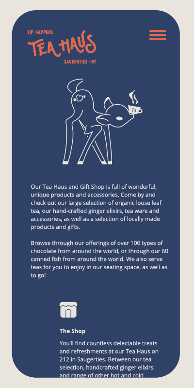
Beyond the website, the illustrations can seamlessly translate to other mediums, including social media, advertising, packaging, and marketing. This approach is especially significant as each tea order is individually packed, with the potential for beautifully illustrated packaging becoming a signature element of the brand.
Beyond the website, the illustrations can seamlessly translate to other mediums, including social media, advertising, packaging, and marketing. This approach is especially significant as each tea order is individually packed, with the potential for beautifully illustrated packaging becoming a signature element of the brand.

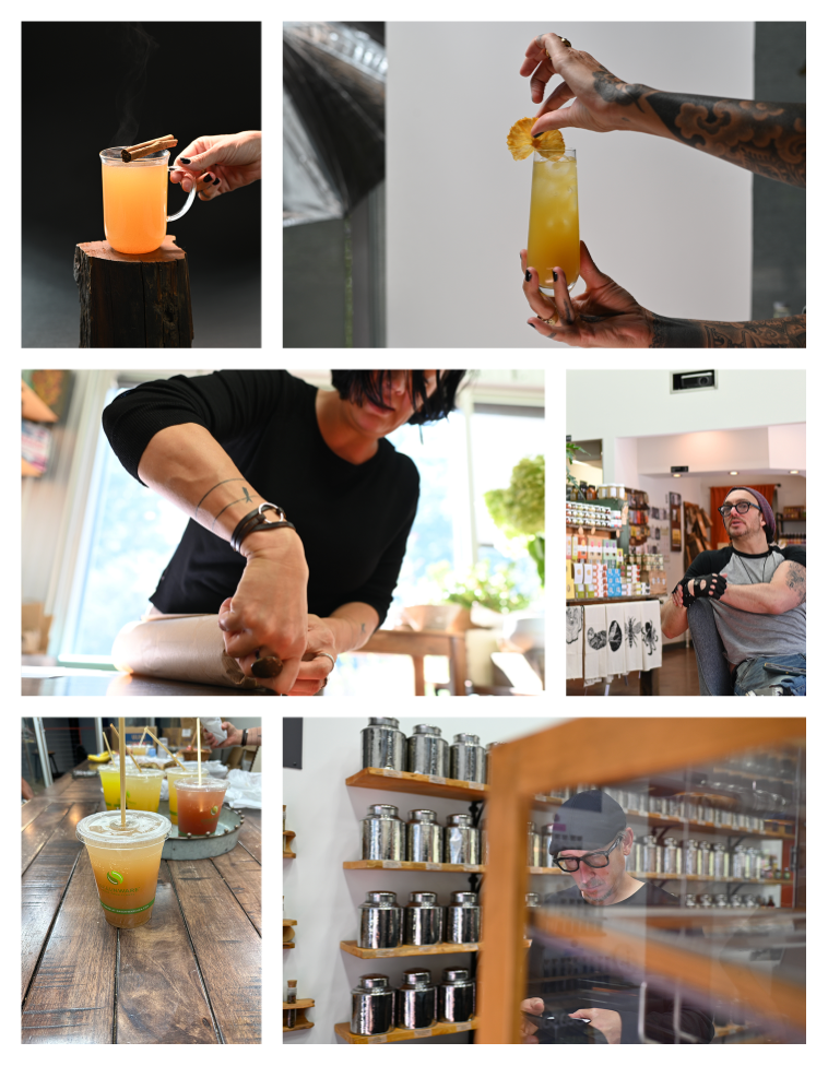
Photoshoot
Capturing the Essence

We didn’t just document Tea Haus; we crafted a visual story. The photoshoot was more than just snapping pictures - it was about capturing the soul of the space. Every shot was meticulously planned to highlight the textures, the atmosphere, and the handcrafted drinks that make Tea Haus special.
By bringing in a professional photographer with a full set of equipment and structuring the day down to the minute, we ensured that every frame felt intentional, authentic, and true to the brand. These images wouldn’t just complement the brand - they would define it.